LUTUM!
LUTUM! is a point-and-click adventure game made entirely out of clay following the story of the protagonist (myself) and my childhood cat Zachary. In the game, the protagonist is woken up in her Brooklyn apartment at night by the sound of an alien screech. Upon going outside to investigate, the protagonist is greeted by her deceased childhood pet cat, Zachary, who has become a human-alien-cat hybrid.
This project is an experiement in using analog materials for digital interactivity, created as part of my senior thesis at NYU Tisch in 2023.
The Story
At an uncertain turning point of her life, the player is introduced to the spirit of her dead childhood cat, Zachary. The loss of a childhood pet marks the end of adolescence for many, creating a new awareness of time and age. Zachary serves as a physical symbol of this uncomfortable transition between adolescence and adulthood.
MEDIUM & AESTHETICS
The focal point of the game, however, is not the story. It is instead the medium. All of the LUTUM! assets are made entirely out of plasticine clay, a putty-like modeling material most commonly used for claymation. All of the sprites were animated by hand using DragonFrame, the industry standard for stop-motion animation.
Why clay? Are you crazy?
I have always had a fascination with the magic of stop-motion animation. As someone who loves to draw, animate, and sculpt, claymation has been a way for me to practice all of my artistic interests. I am also interested in the history of claymation as it relates to modern methods of animation. In a world where VFX and CGI tools have evolved so rapidly, stop-motion animation has become increasingly less favorable and more expensive. My goal is to make claymation a more relevant medium for art and interactivity. I also want to show the possibilities of clay when used in a digital space. I want to reimagine how clay has been used in the past for a new audience: An audience that has witnessed the landscape of digital technology rapidly evolve in the past two decades into the highly polished Internet that is today. (For example, Mac OS.) I want to show that the future of technology does not have to exist without the qualities and methods of analog media.
When I was planning what kind of interactivity I wanted LUTUM! to have, I knew I wanted it to have a point-and-click feel, but not entirely. I explored the basics of point-and-click adventure games and RPG games to get a better sense of where I would go with my game.
Hylics (2015) and Hylics 2 (2020) are surreal stop-motion JRPG games created by Mason Lindroth known for their claymation graphics, abstract art style, and wild storytelling. As opposed to an RPG game, a JRPG is made in the style of a Japanese Roleplaying Game or influenced by the style of early JRPGs such as Dragon Quest, Final Fantasy, or Pokemon. I purchased this game on Steam and was completely blown away by the visuals, the music, and the overall experience. I haven’t gotten around to finishing it yet, but I really loved the structure of the game. The player begins in the map pictured above. The control instructions are floating in space around the map. The player has to explore and interact with NPCs to figure out the story themselves. It never explicitly says, “You need to find the key before you leave.” Everything is kind of cryptic but it encourages lots of thinking, problem-solving, and exploration.
From playing this, I decided to emphasize exploration as a focal point of the game. I loved how big the map was and how far I could make the main character walk around. The animation was seamless and fluid between jumping, walking and going up and down steps. All of the assets have this hypnotic dream fuzz filter over them. It’s somewhere between bitmap art and highly compressed old webcore gifs, but whatever it is, it leaves you scratching your head trying to figure out if it’s clay or not. It is never revealed entirely how Lindroth makes his assets, but he alludes to 3D scanning, traditional stop-motion animation, and the use of Blender to achieve his signature look.
Methodology
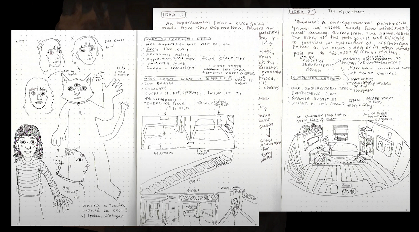
When building out LUTUM!, I was building in the digital and physical worlds. It was definitely a challenge to switch back and forth between physical, digital, 2D, and 3D. Before I could start anything, I needed to have a solid visual plan. I started by sketching out a map with a rough idea of where interactions would take place.
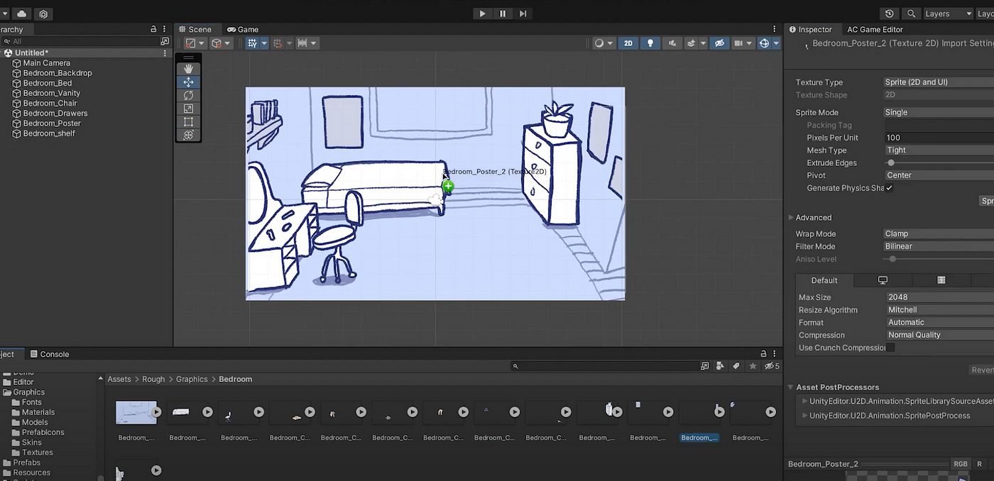
After I organized all of the assets, I sketched out rough stills in Procreate to use as placeholders as I develop the game. It was helpful to visualize and interact with the scene. It made me think about details such as wall posters I might want to include with clay.
The game is built using a plug-in for Unity, Adventure Creator. Adventure Creator, according to the website, is a fully-featured toolkit that has everything needed to make an adventure game. Its interface allows for powerful visual scripting with tools to create NavMeshes for walkable areas, Hotspots for interactivity, and a vast selection of different action types. I chose this plugin for Unity because I wanted to avoid programming the game from scratch considering my two-month time limitation. The visual scripting would allow me to focus more on the idea of clay in a digital space. Because it was designed to create point-and-click games, I was able to use some of the characteristics of point-and-click methodology in my game, but I still had to freedom to make it my own.
Using all of the temporary 2D assets, I began creating a 2D point-and-click game.
The 2D assets in Unity
When I finished making the scene with temporary assets and determined which part of the game was actually feasible, I began making the real clay assets. From what I’ve learned during my time studying stop motion, watching behind the scenes videos, and appreciating the craft, I decided to take a unique approach to puppet building. Traditionally, stop motion puppets are made of a non-malleable material like silicone, wood, or resin castings. The material is assembled on top of a posable ball-and-socket armature skeleton. I wanted to retain the organic look of soft clay, so I covered it in tinfoil and put clay right on top. I used this process for the puppet modeled after myself. When designing myself as a clay character, I decided that my most defining facial features were my bangs and soft nose and eyes. I gave myself an outfit I might actually wear in real life including a pair of Converse Chuck 70s.
For Zachary, I did not use a posable armature skeleton because I wouldn’t be doing any complex motion. I shaped tinfoil into an approximate cat shape and then covered it in white clay. I fixed a bendable wire in the rear of Zachary’s body which I then covered in clay. This would allow me to pose the tail for animation frames.
Building the Set
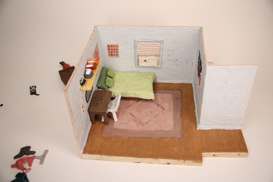
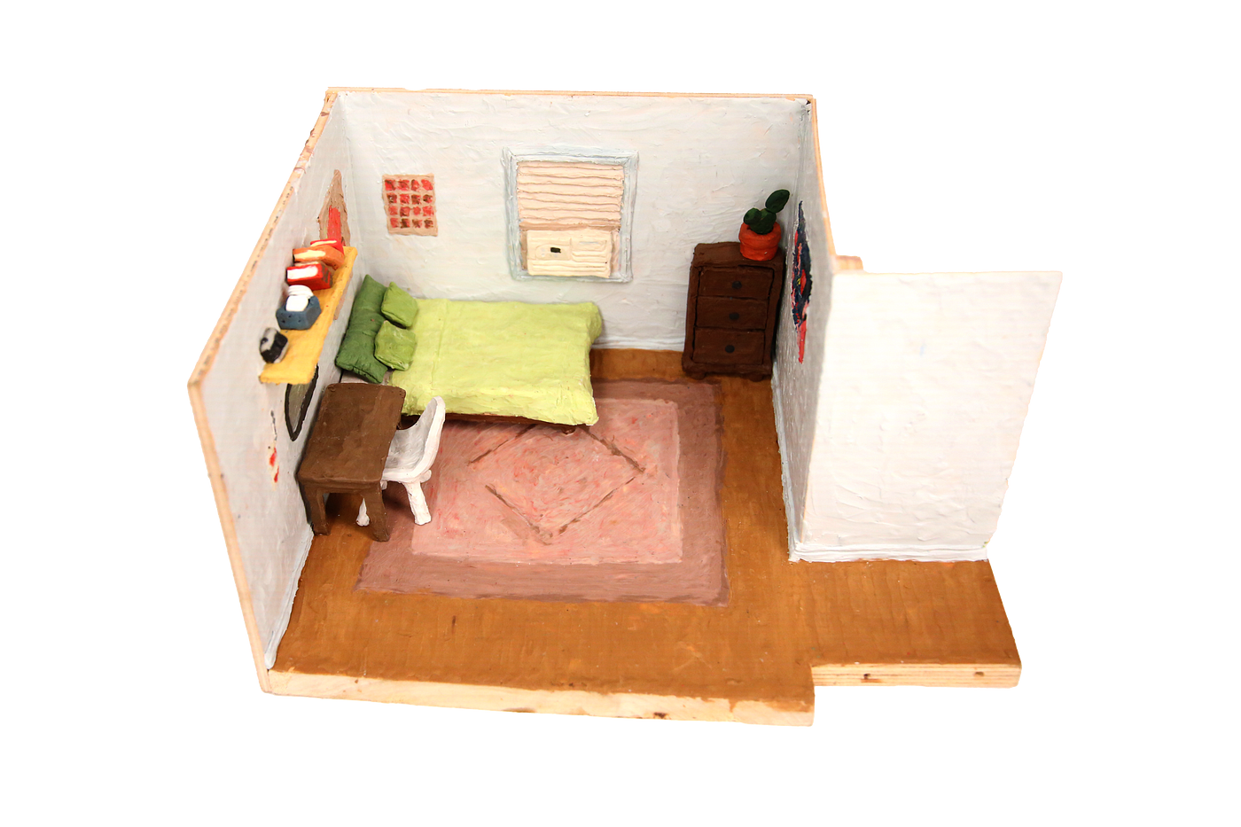
Just like the set designers of The Neverhood, I built the set out of wood then covered it in clay. I referenced my real-life bedroom for this, trying to stay true to the colors, window AC unit, and the artwork on my walls. I also made sure to pay attention to details such as wall trim and wood panel flooring. I created these effects using my fingers and various polymer clay tools. The size of the model is approximately 12” x 12” x 12”. The bed, vanity, and wall shelf were also constructed out of wood then covered in clay. All of the bedroom furniture pieces were moveable in order to allow for separate positioning in Unity.

Photography and Set Animations
I took photographs of the bedroom set with bright, clean lighting as far above overhead that I could manage. The camera I used was the Canon Mark IIII was positioned from an angle above to make the game isometric. I first photographed without the furniture that I wanted to be interactive or animated. Then, I inserted the furniture into the room and took more photographs. My idea was that I would remove these furniture items from the room using Photoshop. This way, I would ensure that the furniture angles would match the angles of the entire set.
 The final image of the set after Photoshop.
The two items in the room I animated were the drawers and the Kit Kat clock. I used Dragonframe to capture several frames of the drawers opening and closing as well as the iconic Kit Kat clock swinging its tail and moving its eyes. I planned to insert the animations as a result of interaction with the item.
I also took photographs with and without dirty clothes scattered around my room. This would allow me to extract them in photoshop and place them in the room in Unity.
Animating Sprites
All of the moving parts of my game would be turned into sprites, two-dimensional objects used in computer graphics and video games. Combining frames creates sprite animations. To be able to play these animations in Unity, I had to create sprite sheets. Sprite sheets are documents that have animation frames for a particular sprite. I removed the background and rigging armature, leaving behind the characters with a transparent background and lined up all of the frames for each animation on a transparent background. I exported this as a PNG, brought into Unity where I created a new animation controller for each sprite. Once the animation was created, I was able to control when animation is played with the animation control panel.
Zachary’s Sprite Sheet
Animating the Julia puppet was much more challenging. The shot list included eight walk cycle sequences from different directions: walk cycle left, walk cycle right, walk cycle up, walk cycle down, walkcycle diagonal-up-left, walkcycle diagonal-up-right, walkcycle diagonal-down-left, walkcycle diagonal-down-right. It also included a talk sequence and a blink sequence.
I used a reference layer in DragonFrame to rotoscope the animation of my puppet. By using a reference of another walk cycle, I knew how to position the legs and arms.
Because I used non-hardening polymer clay, I had to constantly repair and resculpt the body parts during the animation process. When I would move the arm, a crack would appear in the joints. I think this actually added a layer of noise I wouldn’t have been able to achieve otherwise.